Post processing is both a commonly missed and misused step when it comes to Gunpla photography. It’s extremely rare that anyone has their camera set up to take a picture in exactly the right way.
In this article we’re going to talk about how to use some common image editing features to to fix things like exposure and colour balance to give your images a better result.
What you’ll need
Before we start, you’ll need some kind of image editing software like Photostop. I use GIMP for my photo-editing, it’s free to download and also quite powerful. All the features I’m about to use should be available in most image editing programs though.
Colour Balance
We’ll start by doing a worked example using an old photo of my MG Zeta Gundam from 2012.
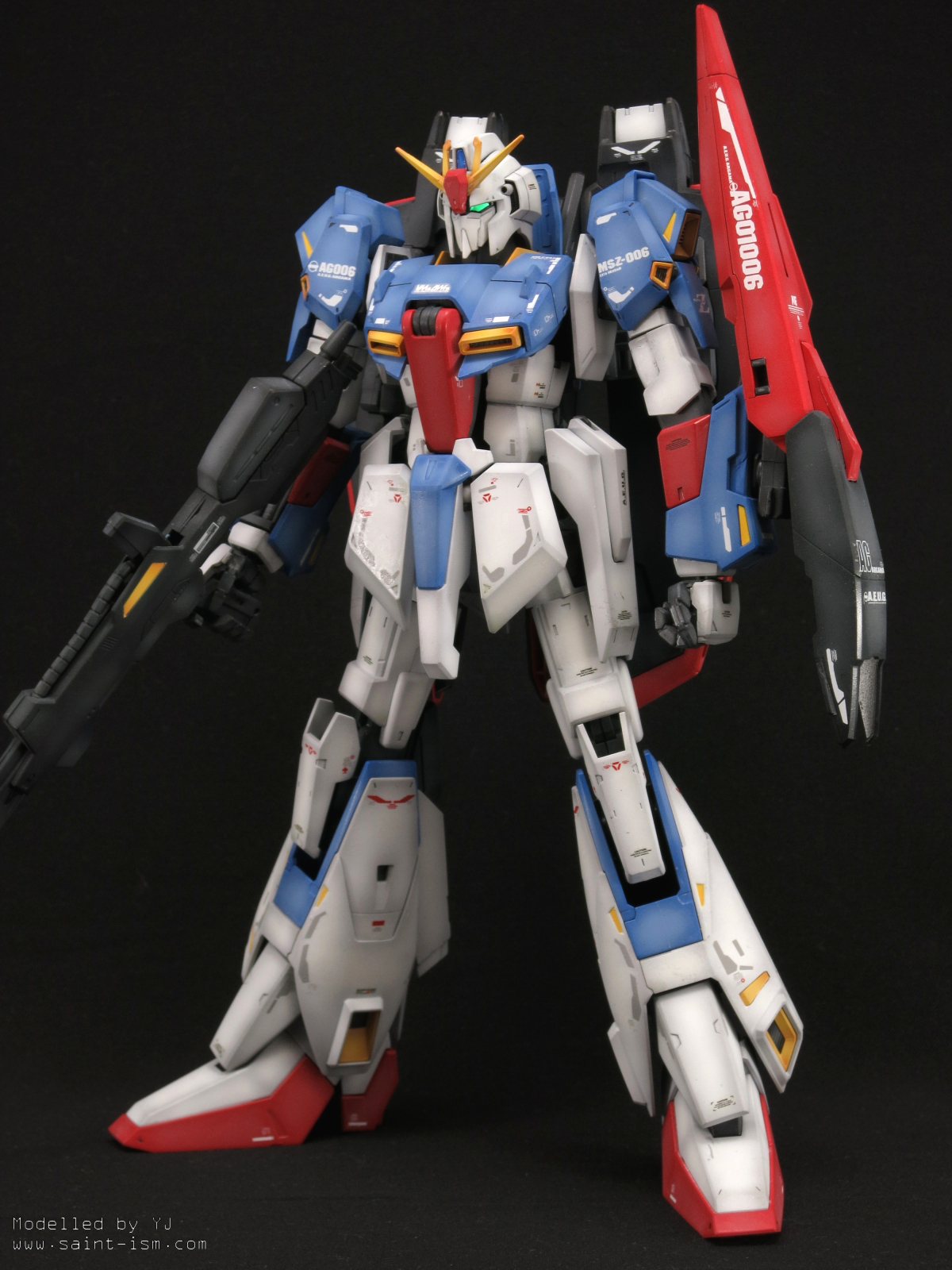
The white balance of the camera I used was a bit off at the time so the image has a slight red tint to it.
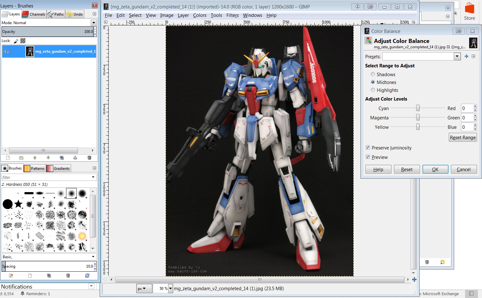
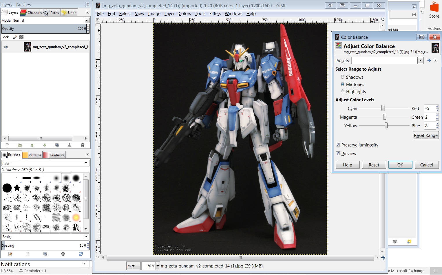
Here I’m using the Colour Balance option in GIMP to fix the image. Our goal is to make the armour look a bit closer to white. I moved the slider towards blue, away from red and added some green.
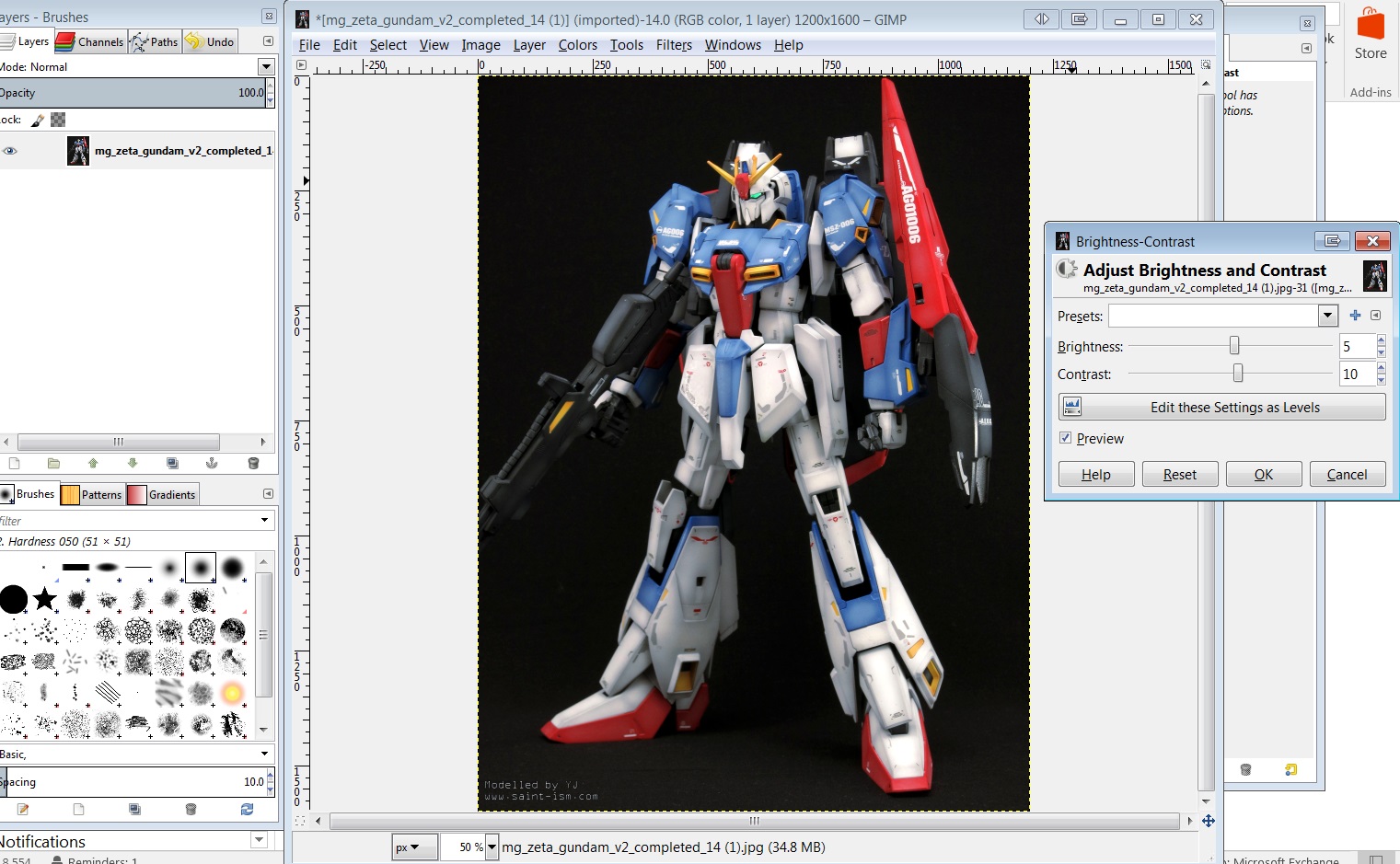
Brightness and contrast
Another easy tweak I use all the time is to adjust the brightness and contrast. It depends on image to image, but usually I increase the brightness by 5 points and the contrast by about 10. Careful not to go overboard as it can make your image washed out or look too saturated.
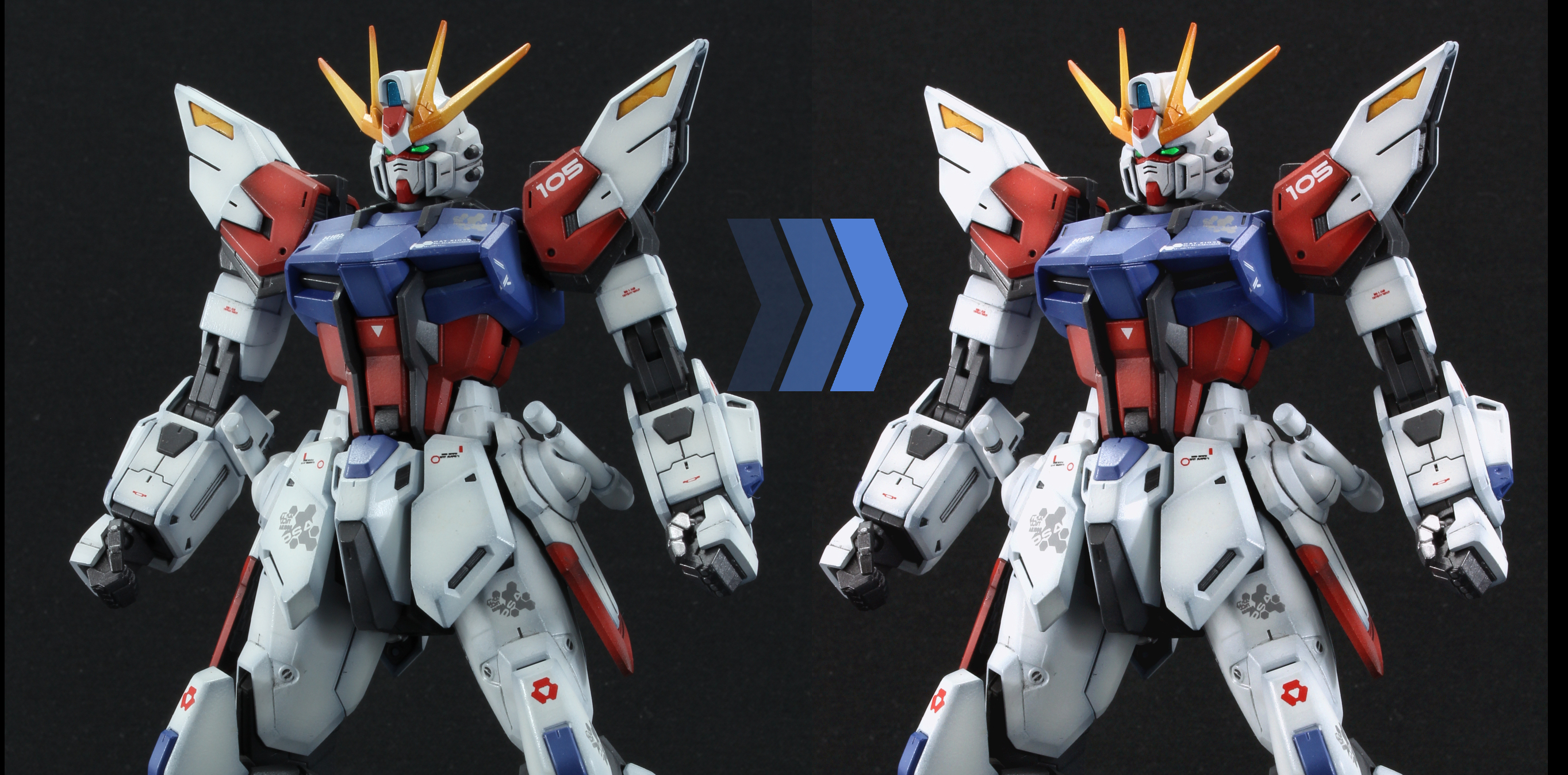
Final Result

Here’s the original compared to the final edited image. Which one do you prefer? Note that there’s no right or wrong way to edit your images, only what you want to present as your end product. In fact your image may look vastly different depending on the monitor or screen it’s viewed on!
Levels
The levels tool is a pretty powerful tool when it comes to fixing images. It lets you correct the brightness, contrast and colour balance of your image all at the same time. It seemed a bit daunting to use at first at first but after understanding what it does it’s something I use to edit all of my images now.
Reading the histogram
When you open the levels tool you will see a graph that looks something like this:
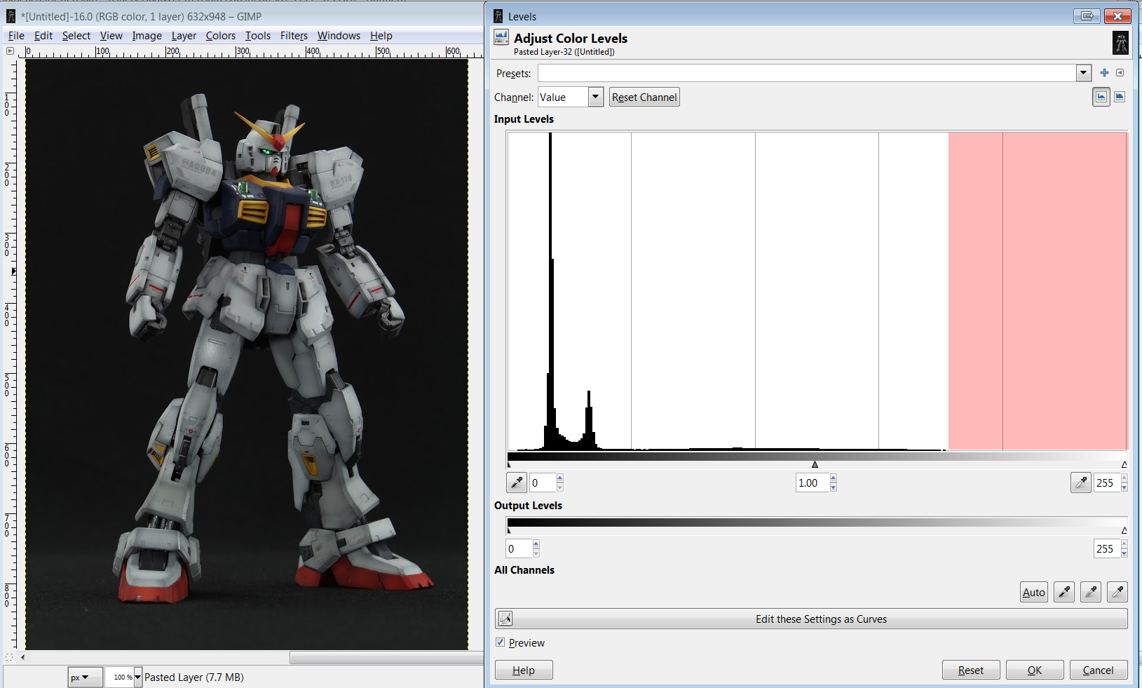
This graph tells you the proportion of pixel and what brightness the are from dark (value of 0) to bright (255).
In this example we can see there’s a pretty large chunk of near dark pixels which is my black background. What’s important though is to note this gap that I’ve marked in red. This means there are very few to no “bright” pixels in the image, and as a result the picture looks kind of washed out or low contrast.
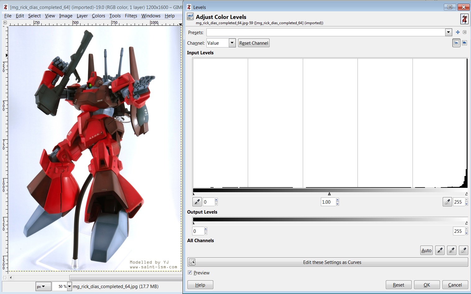
Now here is an example of an overexposed image (or at least the background is). This time the graph has a disproportionate amount of bright pixels compared to everything else. Spikes at 0 and 255 usually indicate extreme over/underexposure where details might be lost, we want to avoid this if possible since this scenario is quite hard to recover from.
What the three sliders at the bottom of the graph allow you to do is to redistribute the pixel brightness by squishing/stretching the graph to the selected range. We can do this in such a way that the whole range from 0 to 255 is used, giving us more vibrant colours.
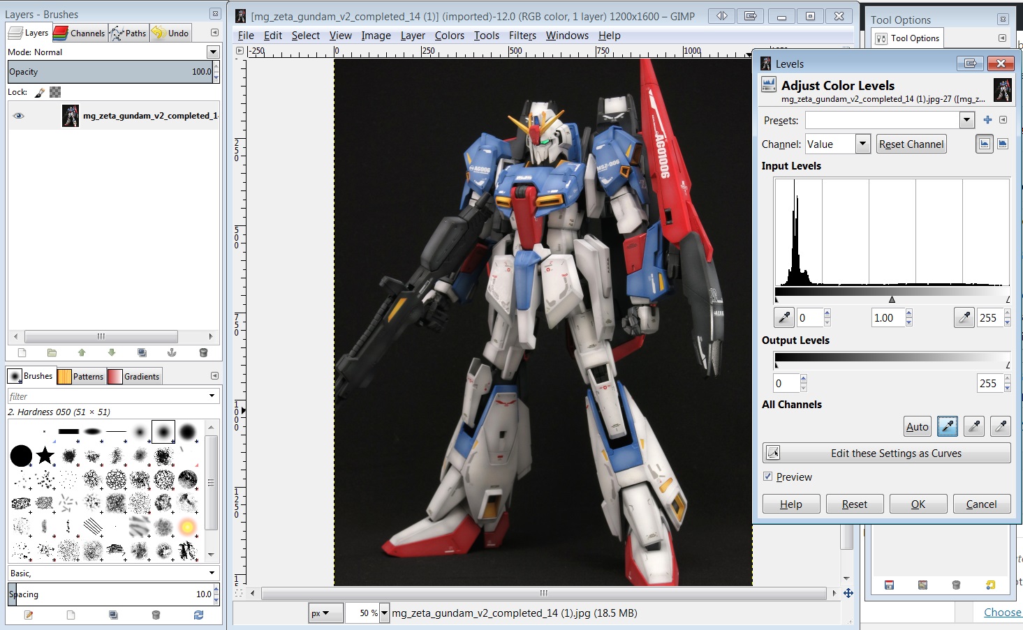
Worked Example #1 – Levels
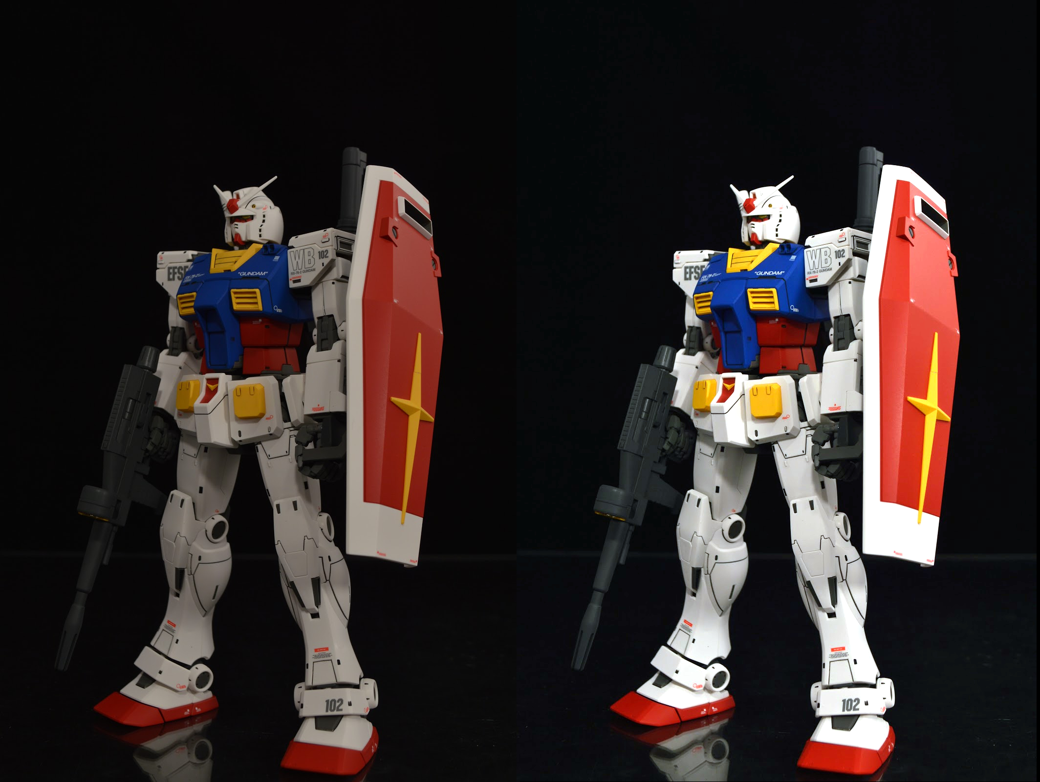
Back to the very underexposed image of my RG Gundam MkII.
Step #1
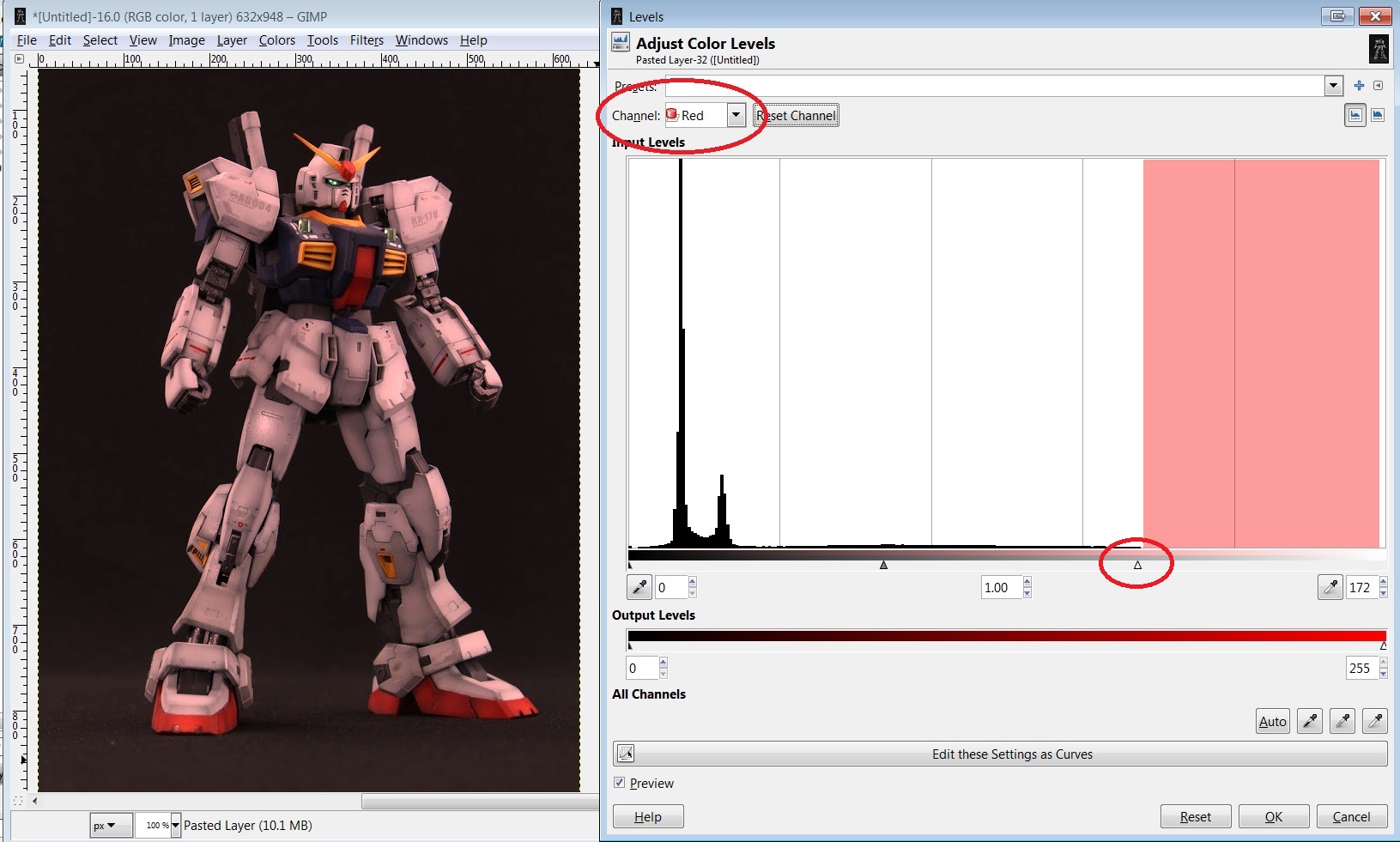
We’ll now work through each colour range and change the levels so that the brightness is better distributed. We’re going to do this at the colour channel level rather than the value since this also lets us correct the colour tint at the same time. First we select Red from the Channels dropdown, and then move the white slider so that it’s roughly where the graph is not 0. Don’t worry about the red tinge, the image won’t look correct until we’ve done all three colour channels.
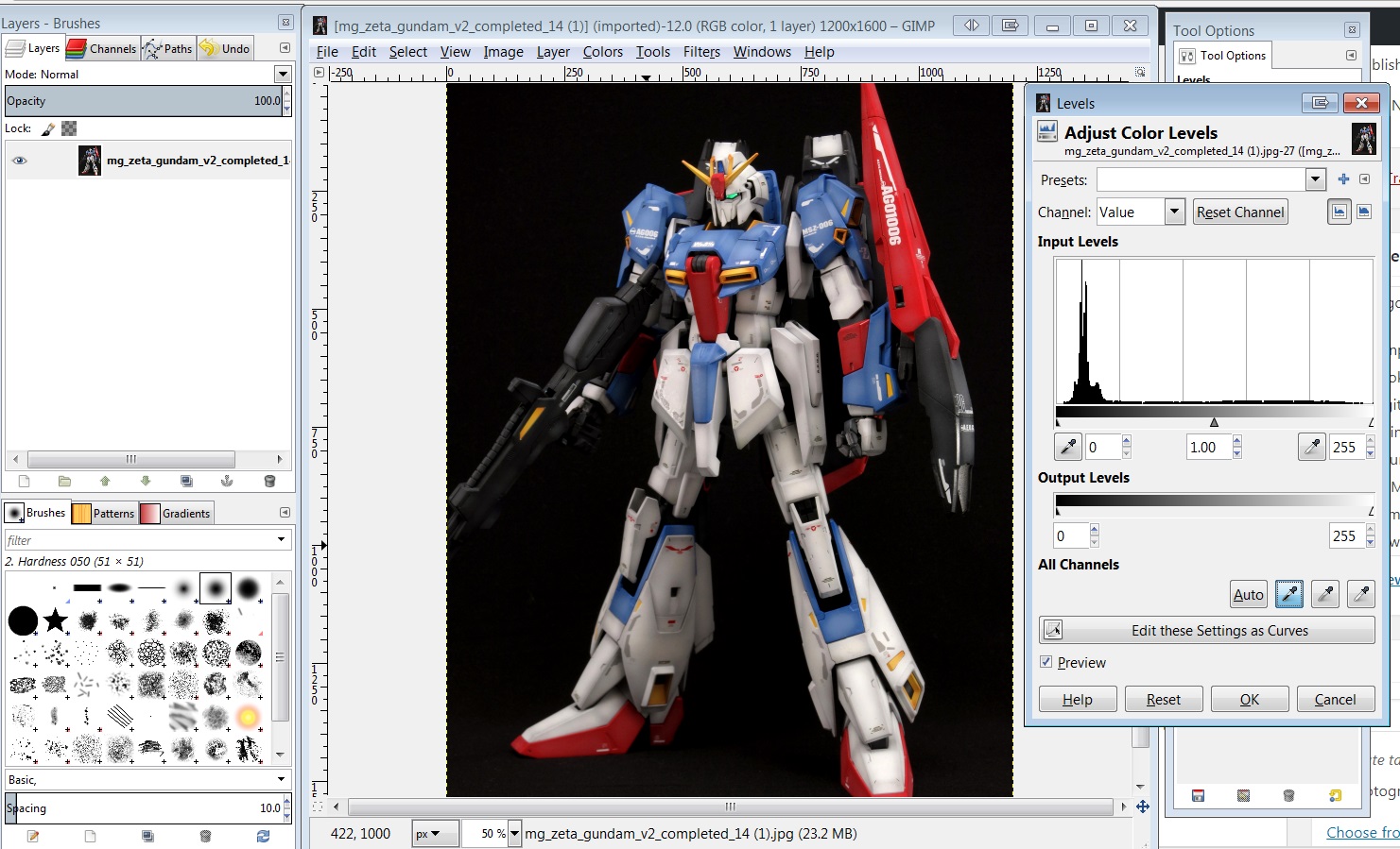
Step #2
Next we cycle to the Green channel and repeat the same process. Don’t worry about being precise, as you can always adjust to your liking afterward.
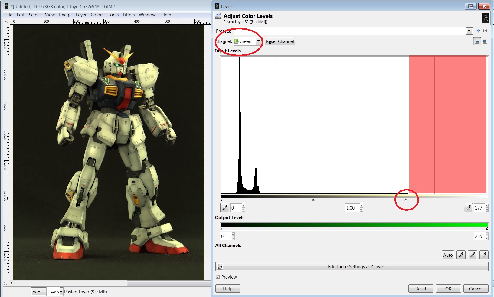
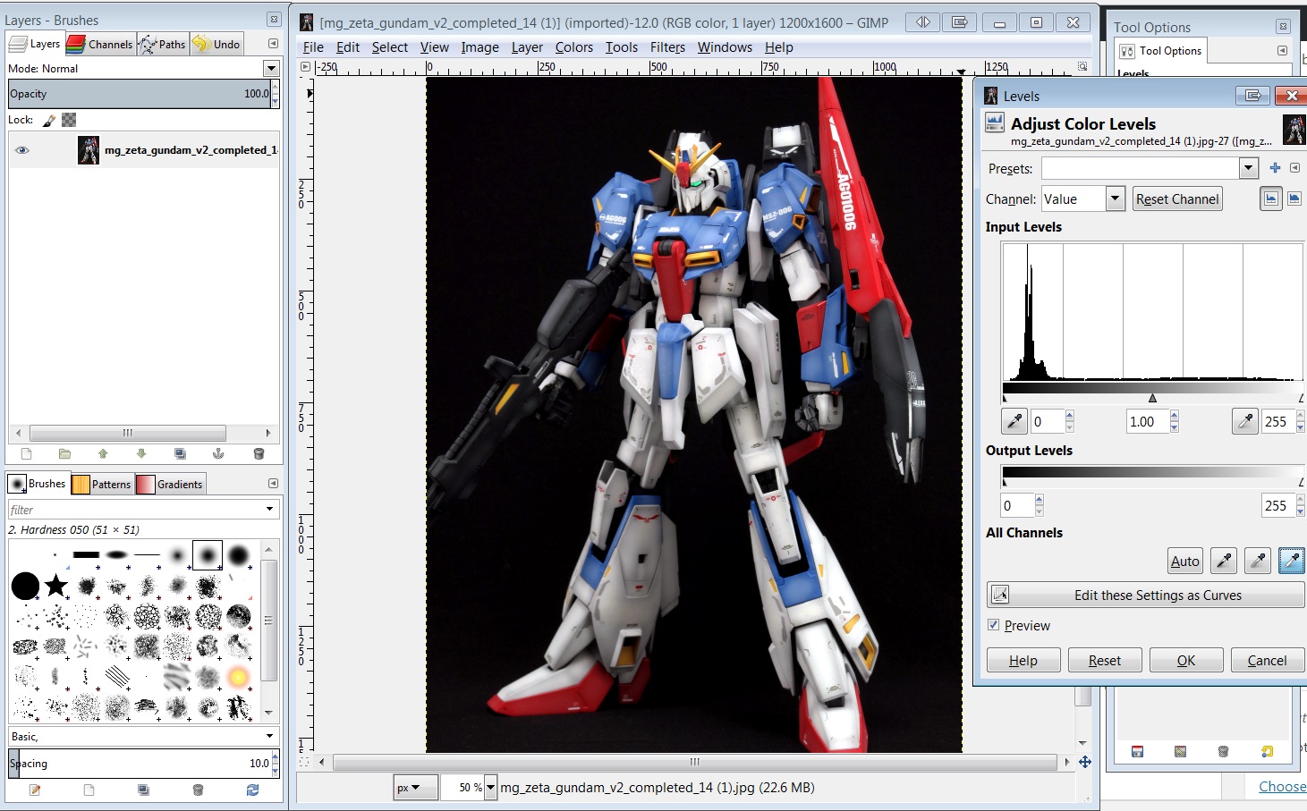
Step #3
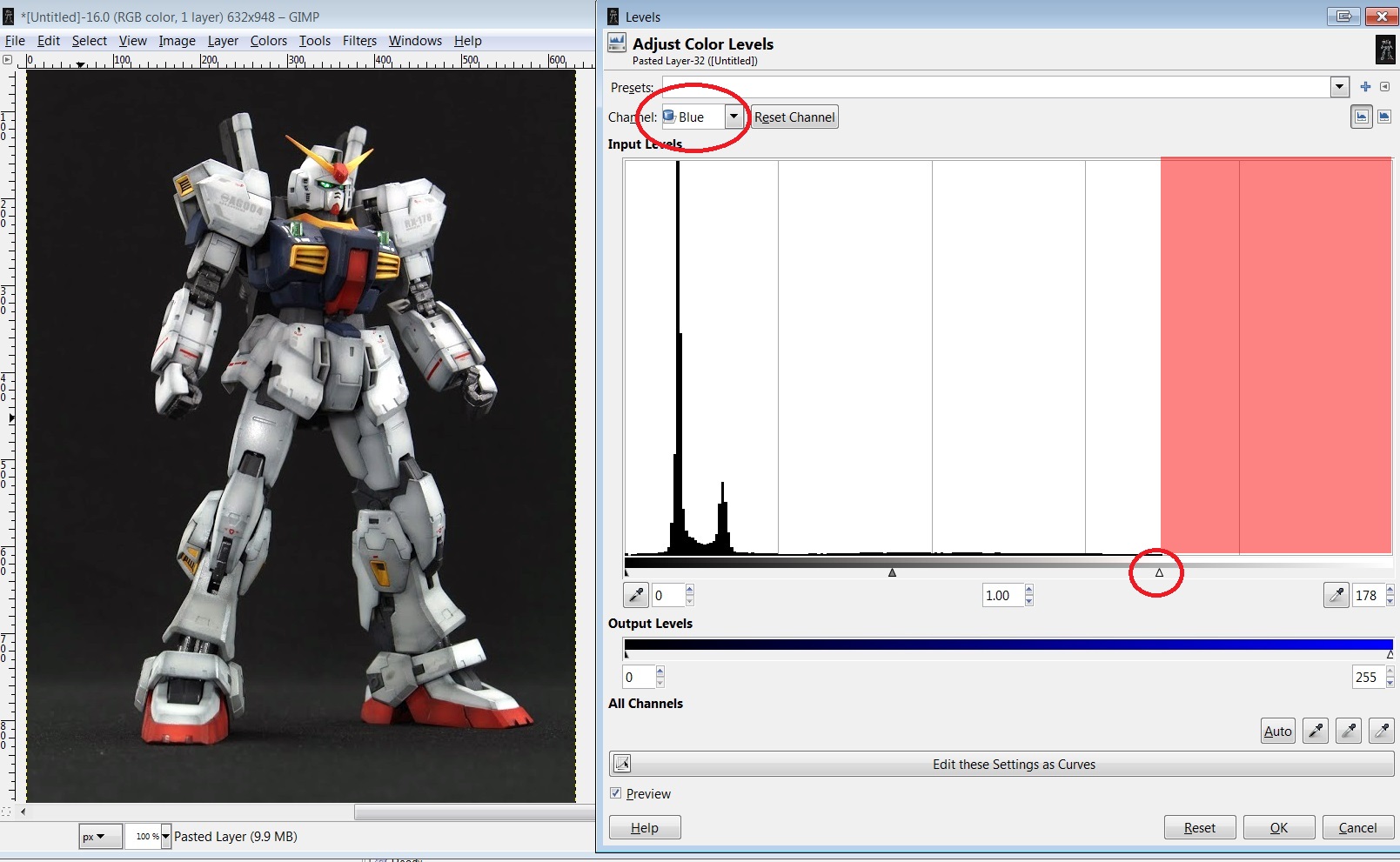
Finally we switch to the blue channel and perform the same correction.
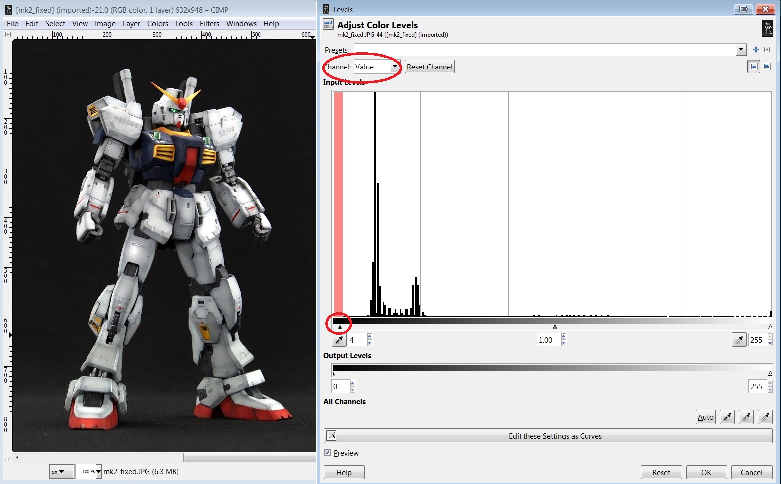
Step 6
Finally as an optional adjustment you can do the same for the Value channel. Note that the same principle applies to the black end of the graph. We want to move the slider to where the first dark pixels start.
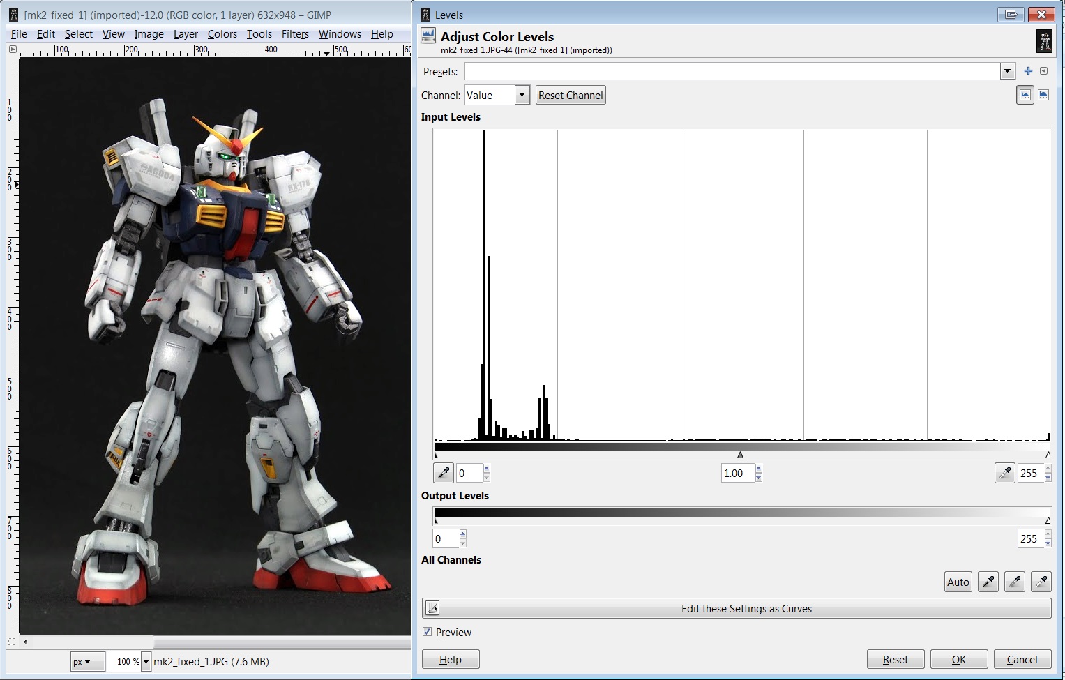
Final Result
The difference is night and day! If we open up the levels histogram again you can see now the graph stretches from end to end.


As another example, I took Goodguydan’s Origin build which is similar to my underexposed MkII and applied the same technique:
You don’t have to stop here of course. Feel free to combine this technique with other options like brightness/contrast/colour balance to get the right kind of feel you want for your image. These days I use the value option first to fix the overall brightness and contrast and then do a slight blue channel correction at the end. You don’t have to be exact as to where you move the sliders, it’s all up to you! Also feel free to experiment with the “midtone” slider in the middle, which can help correct shadows without blowing up the contrast of your image.
Troubleshooting
If you find that the end result is overly bright, try moving the three RGB white sliders a little less to the left.
Worked Example #2 – Using Eye Drop function
There’s also a pretty powerful auto-level function in GIMP and Photoshop. Basically you point out a part of the image that is supposed to be white (or really bright), a part that is supposed to be black and the program figures out the levels needed to correct the image.
Step 1
Back to our original image. Select the black eye drop tool, then click on a black part in the image. I chose the gap in the knee joint and the preview autocorrects the dark levels in the image.
Step 2
Then click the “white” eye drop tool and select the part of your image that is supposed to be white. I chose left skirt armour of the Gundam.

The final result compared to my manual adjustment. Of course sometimes this may not be an option for you if you don’t have any pure white or black colours on your kit, but you could always do a test shot with a white piece of paper and a black object in frame to get the right settings to use for subsequent images.
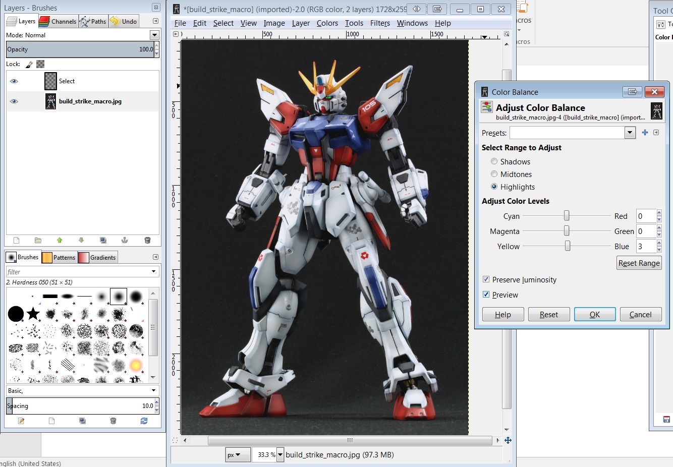
Worked Example #3 – Using Eye Drop function
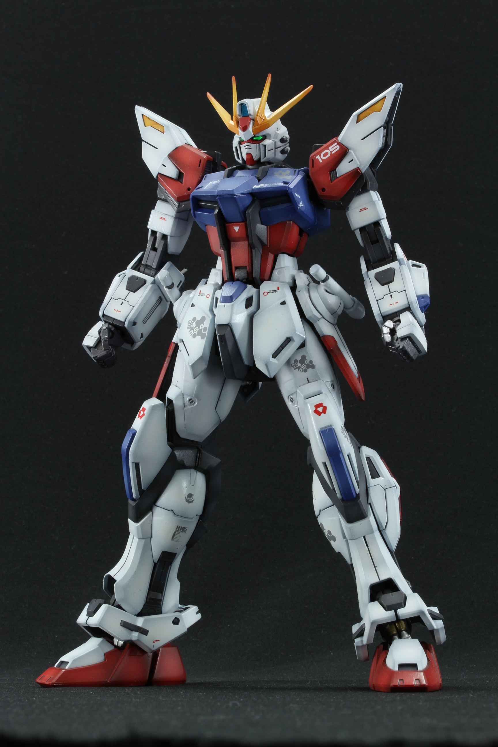
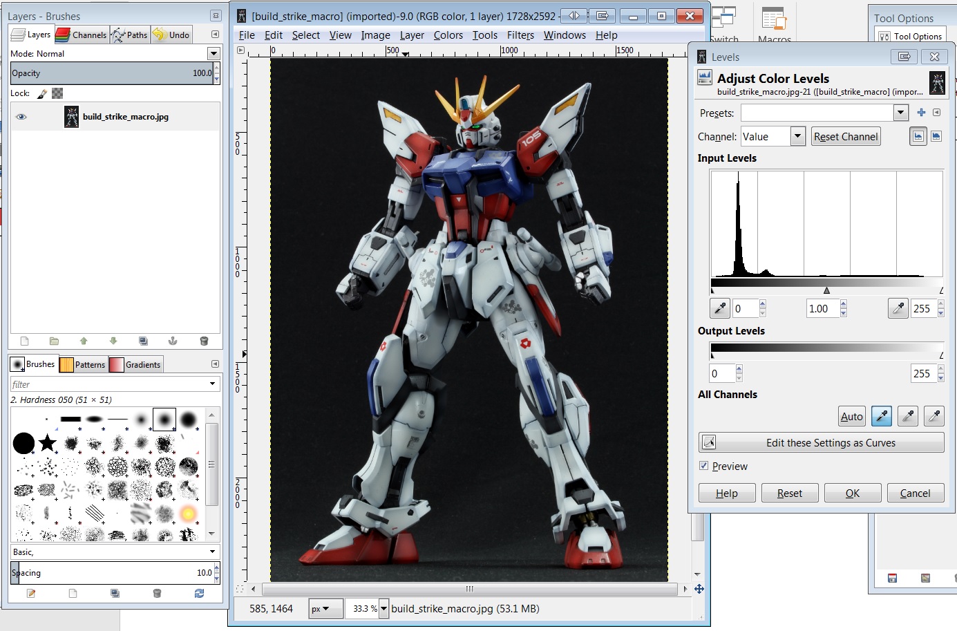
Here’s a picture of my Build Strike Gundam I took with my DSLR. The colour balance is bit off; there’s a bit of a bluish tinge to it and we’re going to correct it.
Step 1
Using the Levels option again, I selected the black dropper and clicked where the knee joint is.
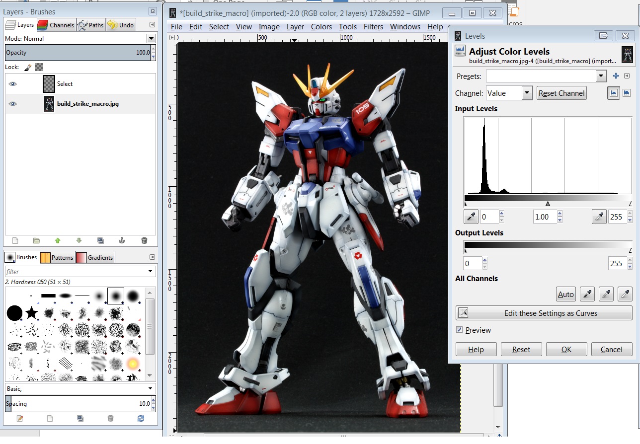
Step 2
Now using the white dropper I clicked around to find the best location for the white calibration. I settled on the right arm of the Gundam since that is the brightest white.
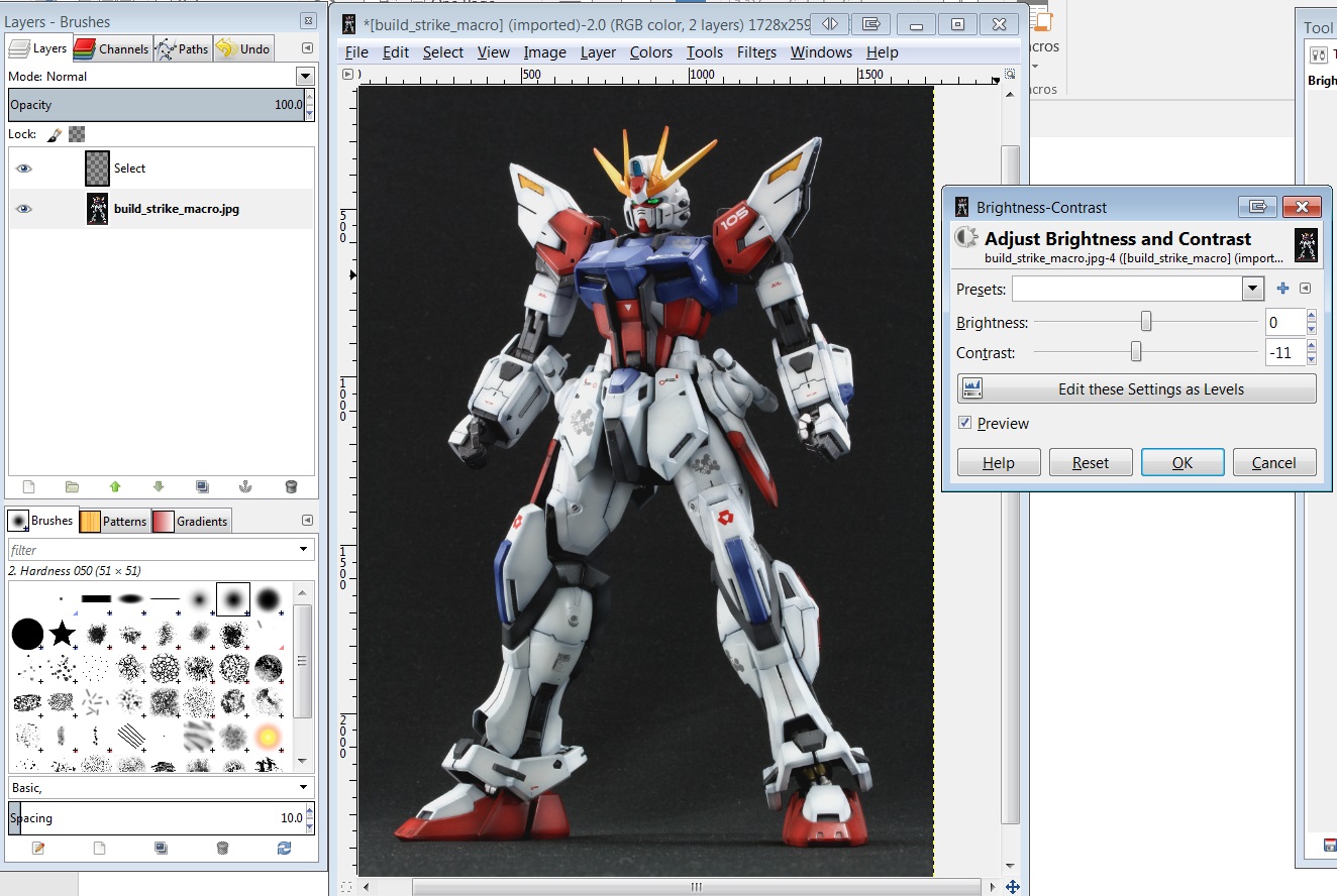
Step 3
The image is still a bit oversaturated so I decresed the contrast by a few points.
Step 5
I went back to the Colour Balance option and added a tiny bit of blue in the Highlights section. A very slight bluish tone often gives that “whiter than white” look.
Final image comparison

Tutorial
Here are some images of the kits I’ve built that I feel could use some tweaking. Download and open any of them in the image editor of your choice and play around with the options we just went through. See what you can come up with!


Extra challenge
I managed to do the following edit of Holocause’s UV painted Unicorn build. The original image has an overly purple tinge to it due to the blacklight. Are you able to replicate it? Hint: Requires “select by colour” tool and some layering.


Final words
Hopefully this tutorial has taught you how to use basic image tools to tune up your images. Don’t forget that there’s no right or wrong look, but rather what you want to present as your final product!
Also please consider becoming a Patron or donating if this guide has helped you! Thanks!
